My role
This project involved working with a product manager and developer to redesign the existing version of the SFDC Support Console. I handled the entire design-side of the project including the restructuring of the information architecture, the entirety of the visual design—from wireframing to creating mockups—and finally to creating a clickable prototype.
The users
The target audience for the SFDC Support Console was primarily HubSpot Customer Support Specialists. Every Support rep, at some point, fields a call or webticket relating to Salesforce. Due to the inability to see directly into a customer's Salesforce instance, these cases are often incredibly stressful and frustrating for the case owner because he or she is essentially flying blind. Individuals in Support often feel overwhelmed when talking to a customer about his or her Salesforce issue due to the differences between SFDC's product and HubSpot's.
The problem
Support reps need help gaining insight into customers’ Salesforce instances in order to solve their Salesforce-related cases. This information is not available in HubSpot, and the existing iteration of the SFDC Support Console increased the cognitive load placed upon Support reps, rather than helping them achieve their goal of quickly and accurately resolving these cases.
The hypothesis
We believe that by creating a more clear information architecture in the SFDC Support Console, we can decrease the barrier to entry for Customer Support Specialists to solve Salesforce-related questions on their own, without the need for extra help from Support’s Salesforce Product Experts.
We will know this to be true when we see a lower time to resolve and an increase in self-service for Support cases involving the Salesforce Connector.
Discovery phase
The existing version of the SFDC Support Console was broken for an indefinite period of time leading up to this redesign. This placed a constraint on the project because this meant that few, if any, existing Support reps had previous experiences with the SFDC Support Console, and it wasn't possible to conduct upfront usability tests to determine areas for improvement. That being said, the product manager and the developer conducted their own research beforehand, and created a list of specific features they knew to be important. We were also able to meet to determine user and business goals for the project at its inception. The remainder of the research for the discovery phase relied heavily our own experiences with the tool, as well as some anecdotal discussions with a few Support reps who had used the SFDC console in the past.
Takeaways from product manager
After meeting with the product manager, I gained a few takeaways to help inform my decision-making moving forwards. These insights included defining user and business goals, and outlining the requirements for the project. A breakdown of this information can be seen to the left. It's worth noting that, while there were many business goals that this redesign was hoping to achieve, these really fell into two main buckets: lowering time to resolve for Support cases, and increasing self-service for Support reps (which results in less Help JIRAs filed and less Slack questions asked).
Discussions with Customer Support Specialists
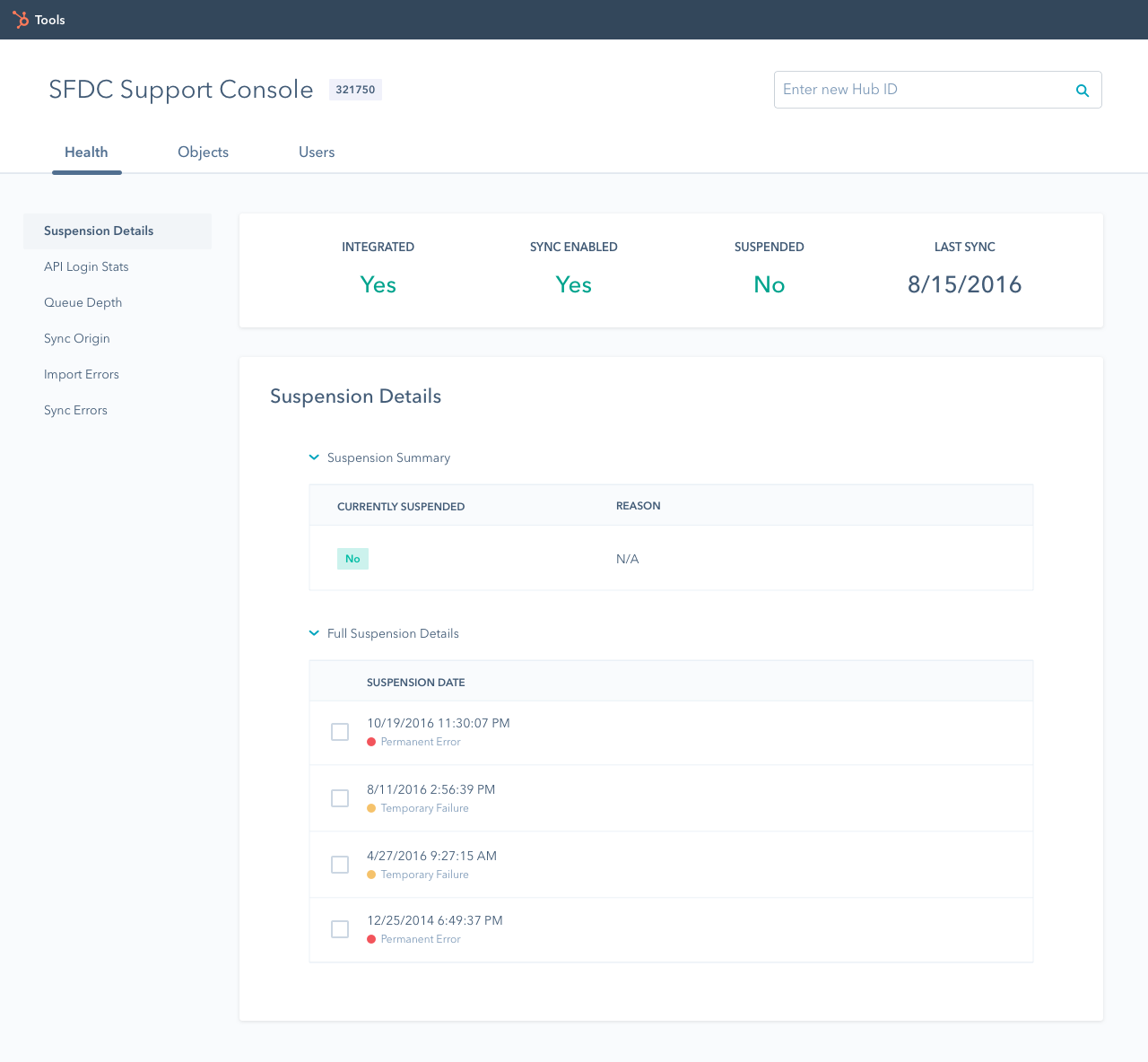
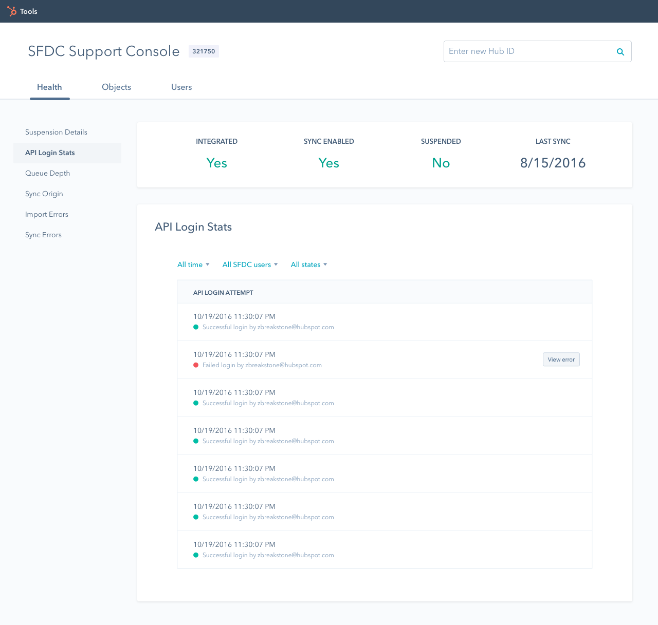
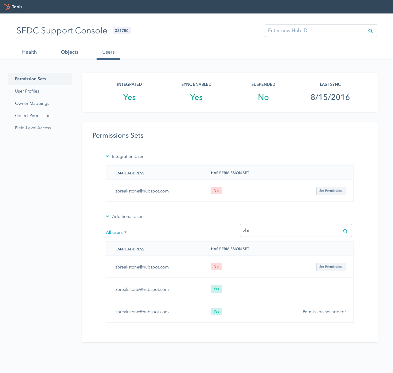
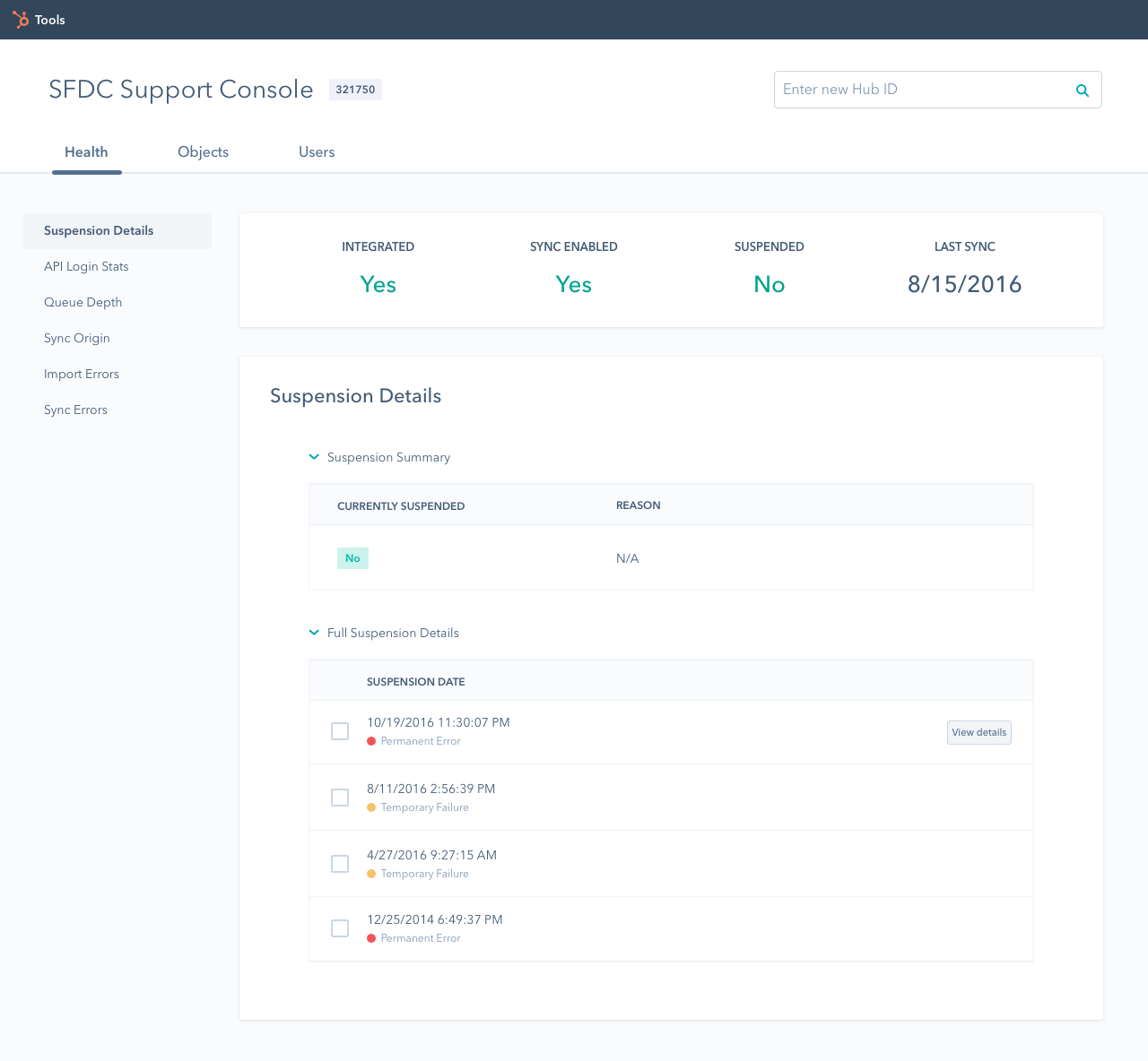
After speaking with Support reps and the product manager, it was clear that the biggest issue plaguing the SFDC Support Console was its convoluted information architecture, which consisted of six primary buttons seemingly only differentiated by color (with no clear signifier for what these colors meant). Additionally, there was no attempt to simplify the complex information that was displayed when these buttons were clicked. From our discussions with Support, we found that reps often had to rely on memorization to find the specific information for which they were looking, as there was no clear mapping between the buttons and the information displayed.
Ideation phase
The ideation phase for this project was fairly brief, and mostly involved determining a better information architecture through which the Salesforce data could be displayed. The product manager and developer had previously determined which features to prioritize based on data from past Support cases and their own experiences using the tool as Salesforce Product Experts during both of their times in Support.
Pseudo card sort
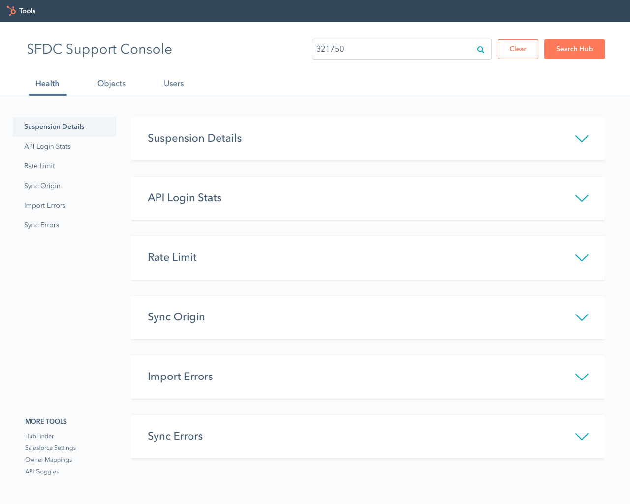
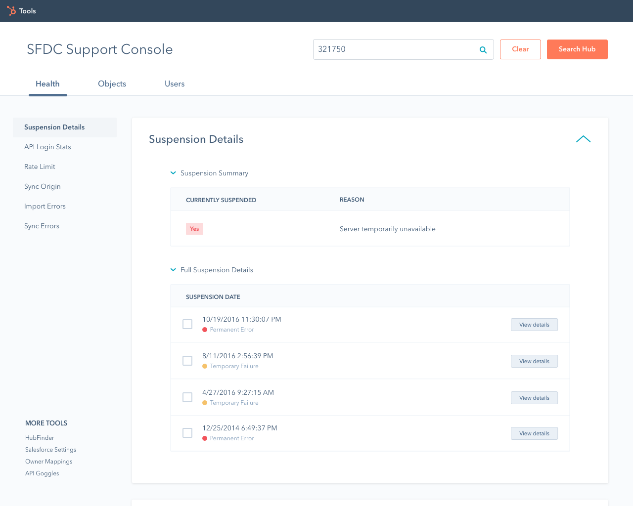
We decided to list out all of the features that the team chose to include in the tool to determine how these could be grouped together. In retrospect, this process was essentially an open card sort that we conducted on ourselves. We determined three main groups for the features: information relating to the health of the connector, information relating to the Salesforce objects (Contacts, Leads, Accounts, Opportunities, Campaigns, etc.), and information relating to the Salesforce users themselves. The features and the resulting groupings can be seen to the left.
Site map
With the groupings gleaned from my "pseudo card sort", we were able to create a site map to outline the general information architecture of the SFDC Support console, and the relationships between each section of content. The different colorations represent different tiers of nodes: green being the primary level, blue being secondary, orange tertiary, and finally magenta being the quaternary level (I had to look up "quaternary").
Design phase
Once the information architecture was approved, we were free to move into the design phase of the project, following one specific constraint: the SFDC Support Console needed to adhere to the SpaceSword design language outlined by our Product Design team. With this in mind, we started the process by creating low-fidelity wireframes before moving to high-fidelity mockups, and finally clickable prototypes to help convey the interactions for the design. This phase ended with a live MVP containing the basic components we deemed necessary to get this into the hands of HubSpot Support, as it was an essential tool for troubleshooting, and the previous version was no longer live.
Whiteboard wireframes
To ideate on the overall layout of the SFDC Support Console while keeping the time/energy cost as low as possible to allow for quick iteration, we created a series of low-fidelity whiteboard wireframes. By doing so, we were able to quickly determine a direction in which to head without spending time pushing pixels on the computer. Some of these wireframes can be seen to the left.

High-fidelity mockups - First iteration
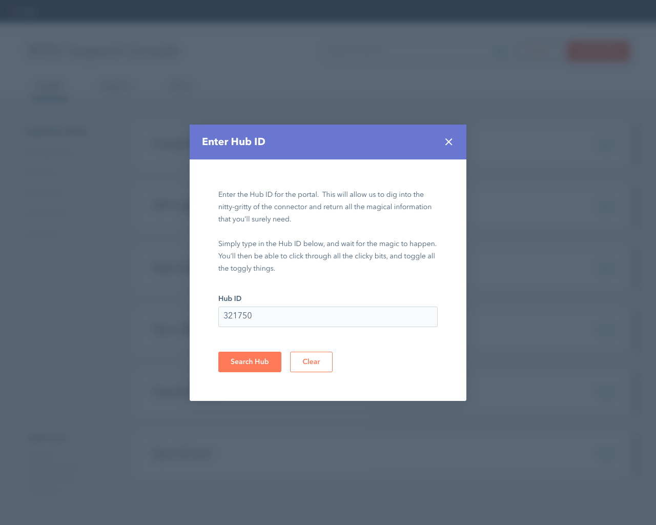
After deciding on the general layout using whiteboard wireframes, we began digitizing the designs using Sketch. The images to the left depict the first attempt at using the SpaceSword design language. Our thought process here was to limit the content initially shown to users to avoid presenting them with the same overwhelming deluge of information that the old SFDC Support Console presented (after the user found their way through the maze of buttons, of course). However, with feedback from a member of the Product Design team, it became clear that this was not the best approach, and we needed to iterate on our design.
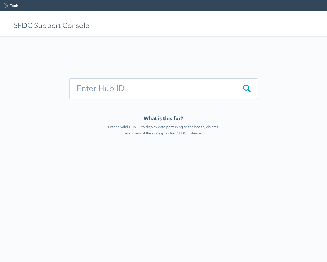

High-fidelity mockups - Second iteration
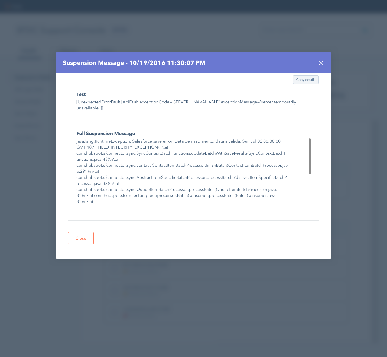
With several pieces of feedback from the Product Designer with whom I spoke, we iterated on the design to better utilize HubSpot's SpaceSword patterns and to reduce the cognitive load on the users. We focused more on displaying the important information up front instead of hiding it behind expandable sections. We also removed the modal window from the zero-state screen, and worked on creating better mappings between the components and the actions they afforded. This was especially relevant when it came to the placement of buttons in the interface. The search bar, and the modal window are prime examples of this.
Prototyping
Once the designs were approved by the team, we created clickable prototypes using Invision for use during usability tests with Support. Due to the fact that a good portion of our design process was based on our own assumptions, we wanted to test the designs to validate these decisions. However, due to time constraints, it became necessary to build out the designs before we could get to usability testing.
Click here for Invision Prototype.